 July 31
Today we uploaded the files for the jacket and the endsheets. The only element that hasn’t been sent off to Toppan Printing is the layout for the foil stamping on the spine of the book. After two years and seven months of inspiration, travel, and toil, A JOURNEY THROUGH LITERARY AMERICA is on the verge of being fully realized. Only a slight sliver of foil remains.
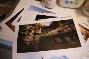
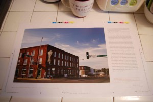
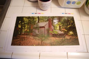
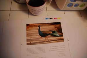
We have seen first and second proofs for the main part of the book. These are called “press proofs” or sometimes “wet proofs.” They are printed on the same paper that the book will eventually be printed on (Japanese Oji White A Matte), on proofing presses that aren’t as large as the behemoths that will print the book, but are still quite formidable pieces of equipment. So, what I am actually holding in my hand is about as good a facsimile of how the book will look when it is finally printed as one could get. Sadly, press proofs are on their way to becoming an obsolete technology, to be replaced by digital proofs.

It still seems like magic to me how, using the bright inks of cyan, magenta and yellow—in shades which seem the opposite of “rich”—combined with black, the printer can reproduce anything from Monet to Manuel Alvarez Bravo—and everything in between and besides. There is artistry, often overlooked, involved in the separation of the colors to CMYK (cyan, magenta, yellow, black). More about that later, perhaps. What I should say now is that the proofs are looking very fine. I do not believe I am saying this as a father would say he loves his son. For in the 12 years I have been working at Toppan I believe I have overseen close to one thousand projects, and I believe I have attained a level of objective distance, professional detachment—enough perspective to look coolly on in judgment. I look at these proofs and the quality of the reproduction of the images—and the proofing—looks first rate. I owe it all to photographer and designer Tamra Dempsey and to Bright Arts colour separation house in Hong Kong.

Now we just waiting to see a few dangling elements: the long awaited map, and the front matter and back matter. The front matter includes the title page, half-title page. copyright page, preface, and table of contents. All of these things I knew about but I was always fuzzy on until the wheel turned and it was my own book. The back matter includes the map, the footnotes, and endnotes, a few odds and ends. My father was an English teacher at Rice High School in Burlington, Vermont for over thirty years. He taught term paper writing by the book, with index cards, outlines, footnotes and bibliographies, and trips to the University of Vermont library (which seemed immense at the time) to do research. There was no way that this book, my first, would go without endnotes and a bibliography—compelling evidence of a well-researched work. In fact, at last count, it had 388 endnotes. They are unobtrusive. Just like the two extra buttons a shirtmaker sews on a dress shirt below all the others. There if you need them. Don’t let the endnotes throw you; A JOURNEY THROUGH LITERARY AMERICA is not written in the prose of high academia. It is a book about the lives of some of the most interesting people who ever walked the American earth – America’s writers – and the places that inspired them, with over 140 photographs, and hand drawn maps by Sinclair Lewis and William Faulkner. The book would appeal to anyone from a perspicacious high school student on up.
I am not sure if it was the best idea to start this blog “in the middle of things.” But perhaps this brings you closer to the (measured) excitement I feel than if I had anesthetized you first with relentless verbiage (the term has always made me think that was what rabbits would eat, if they ate words) about the book, its origins, purpose, etc.
